Make Me Hungry
Leveraging Behavioural Psychology & UX Research to Boost Conversions
The problem statement
"How might we reduce cognitive load while creating an experience that feels effortless and rewarding?"
The existing app suffered from:
- 38% abandonment rate during ordering
- Negative NPS (-21) indicating user frustration
- 8+ taps for basic tasks (vs. competitors' 3-5)
- Emotionally flat experience lacking engagement
Project Goals
- Reduce order abandonment by minimizing cognitive load and streamlining the mobile ordering flow.
- Decrease friction in core tasks by reducing unnecessary taps and aligning interactions with user mental models.
- Improve user satisfaction and NPS by addressing frustration points identified through UX research.
- Create an emotionally engaging experience that feels effortless, rewarding, and intuitive.
- Increase conversion rates through psychology-driven design decisions that guide users confidently to completion.
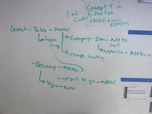
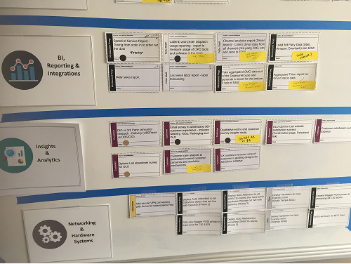
Sprint Planning

How did I turn research into insights


Competitor in CDR Space
Guest user from home page to checkout Choosing and customising a signature menu from each brand.
User Personas
Emily Carter – The Busy Working Parent

I choose Panera because I can order in 60 seconds. Outback feels like filling out a tax form.

Bio
Emily is a 38-year-old marketing manager and mother of two living in suburban Atlanta. Between juggling work deadlines and shuttling kids to soccer practice, she relies heavily on food delivery apps to keep her family fed. An iPhone user, Emily values speed and simplicity above all else - she needs to place orders quickly during brief moments of downtime. Her go-to apps are typically Uber Eats and Panera because they "just work," but she occasionally craves Outback's steak dinners. However, she gets frustrated when the ordering process feels like unnecessary work rather than a convenient solution.
Goals
- Fast, predictable ordering – Wants to reorder favourites in < 3 taps.
- Clear delivery vs. pickup options – No ambiguity in buttons.
- Visual confirmation – Needs food photos and order progress indicators.
Pain Points
"Why does Outback make me type my address in three separate fields?"
- Frustrated by long address entry when competitors (Panera, Uber Eats) allow single-box autocomplete.
- SEQ score for location entry: 3/7 (lowest among competitors).
"I don’t have time to guess which 'Order Now' button is for delivery!"
- Confused by identical-looking buttons for dine-in, pickup, and delivery.
- 37-50 age group gave Outback the worst NPS (-30) due to unclear navigation.
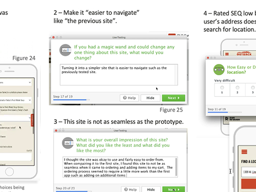
"I need to see what I’m ordering—no pictures, no trust."
- Abandons cart when the dinner menu lacks photos (a top complaint in usability testing).
Javier Mendez – The Tech-Savvy Foodie
Outback’s steak builder is genius—if you can survive the 1998-style checkout.

Bio
Javier is a 28-year-old designer based in downtown Austin who orders delivery 4-5 times a week. As someone who designs digital experiences for a living, he has zero patience for clunky interfaces. The Android power user expects food apps to be as streamlined as Google's products, with smart defaults and minimal friction. While he appreciates Outback's quality ingredients and customization options, he often abandons his cart when encountering outdated design patterns. Javier wants his rare steak cooked perfectly, but only if the app makes ordering it just as precise and effortless.
Goals
- Zero friction – Expects Google-level speed (autofill, smart defaults).
- Discoverability – Wants all customization options (e.g., steak temps) upfront.
- No interruptions – Demands a guest checkout path.
Pain Points
"Why can’t I copy-paste my address like every other app?"
- Infuriated by outdated address fields (vs. Uber Eats’ seamless paste-and-go).
- SEQ score for location entry: 2.5/7 (young users demand efficiency).
"The steak customization is buried!"
- Loved the temperature graphic (85% positive feedback) but couldn’t find it on mobile.
"Stop blocking me with login pop-ups before I’ve even picked food."
- Exits when forced to log in prematurely (a top abandonment reason in testing).
Wireframes
Early Sketches , Ideations, annotated wireframes

Annotation for various scenarios
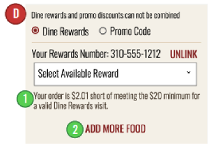
D) Scenario: User has not met the $20 criteria for a Dine Rewards visit in their current order.
- The total amount the user is short from the $20 minimum is displayed
- Selecting ADD MORE FOOD will take the user back to the menu screen
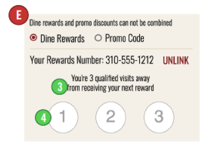
E. Scenario: User has linked their Dine Rewards number but does not have any rewards currently available.
- Number of qualifying visits remaining until a reward is earned Is displayed
- A graphic of how many visits earned is displayed
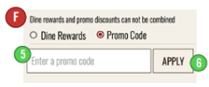
F: Scenario: User has selected Promo Code
- Text field where user may enter a Promo Code
- After entering a valid Promo Code and selecting APPLY, scenario G is displayed.
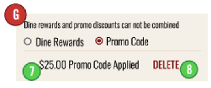
G: Scenario: User has entered a valid Promo Code
- Total amount of valid Promo Code applied is displayed and subtracted from the order Subtotal.
- Selecting DELETE will remove the applied Promo Code and display Scenario F.
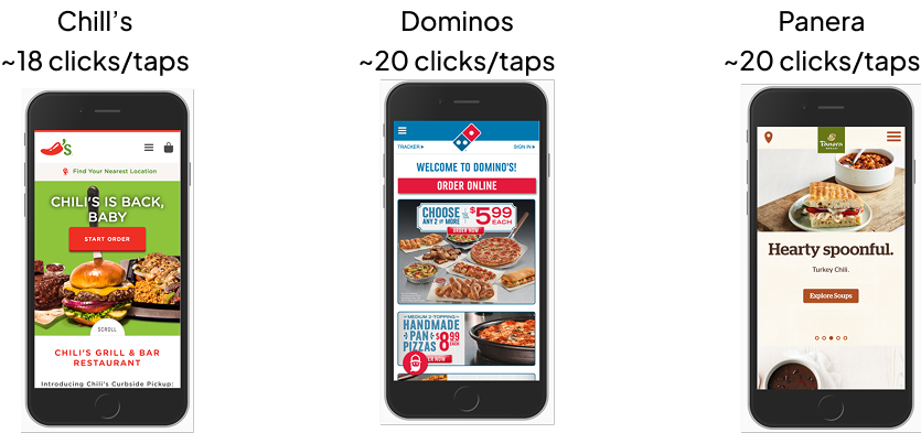
Current State
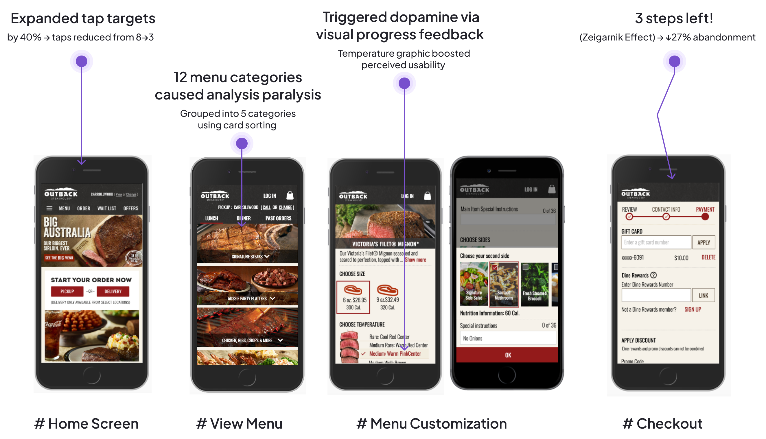
~36 taps from home page to checkout

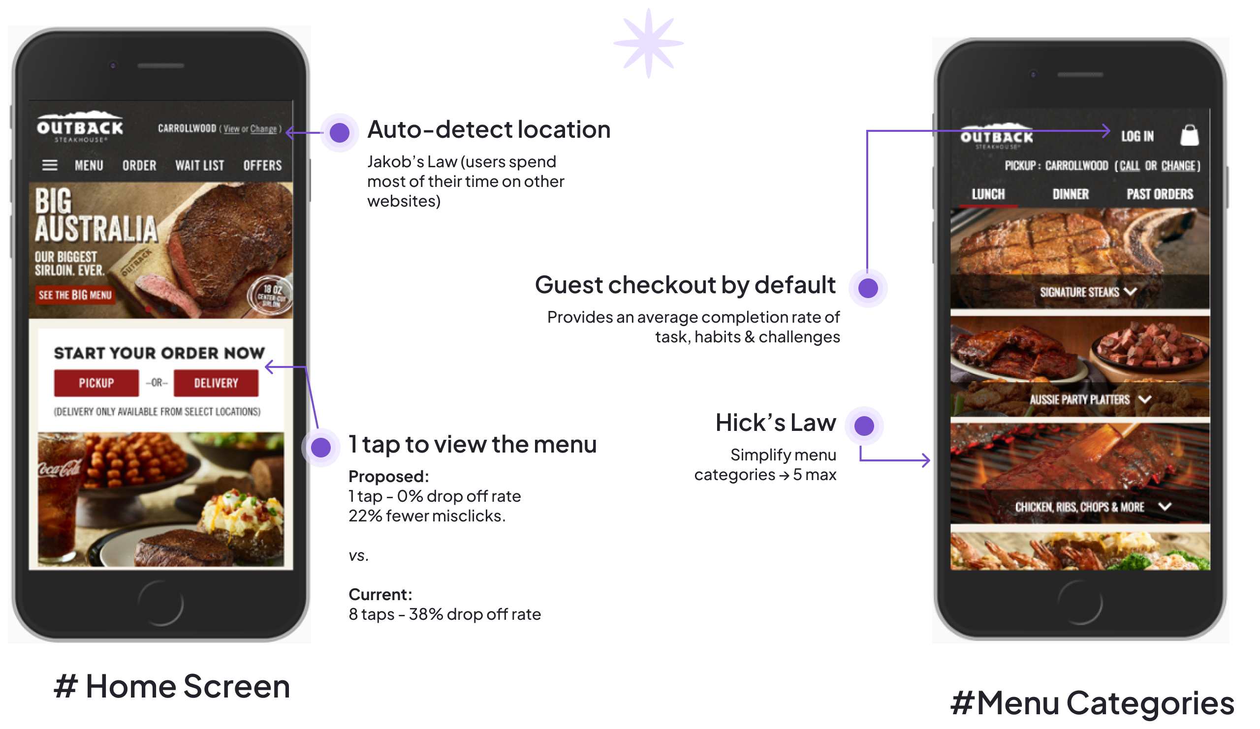
Future State Hi-Fi Designs
1 tap to view menu. Zero drop off rate
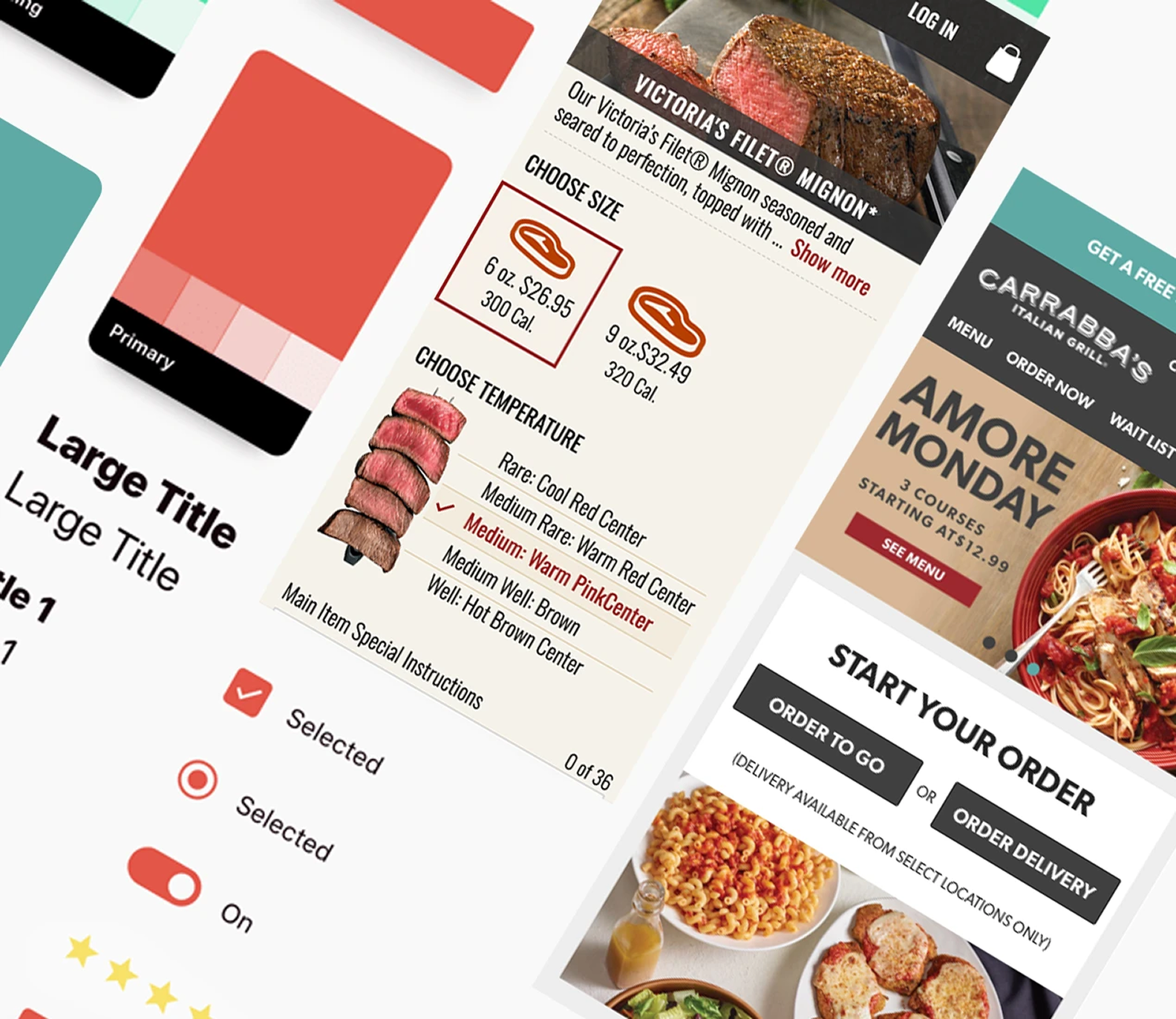
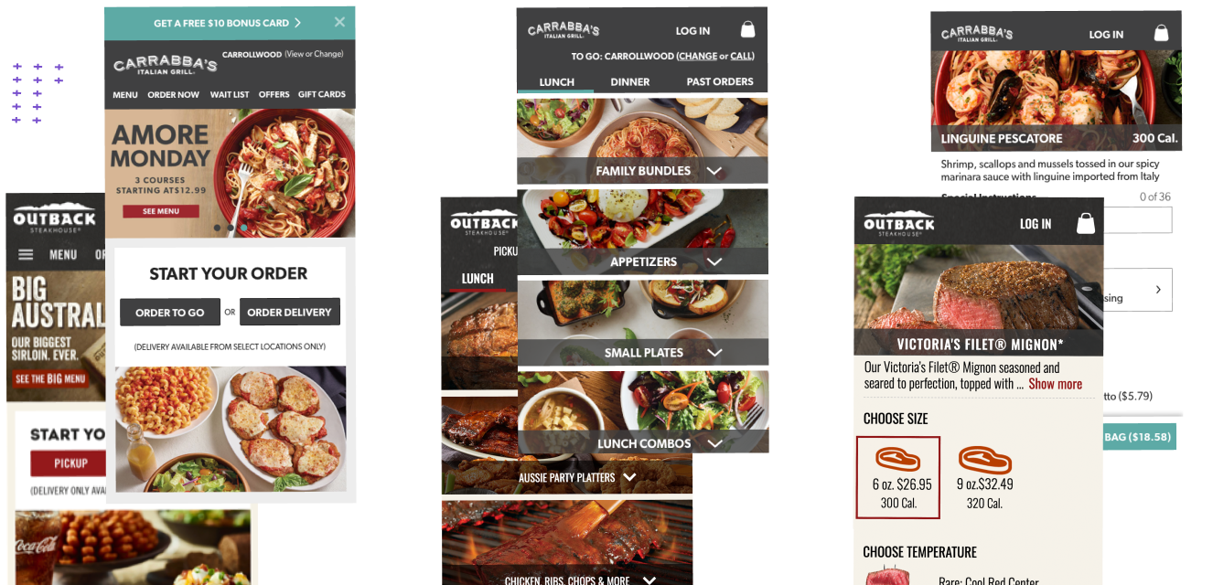
Multi-Brand Design System for Bloomin’ Brands
Built a scalable design system using Outback’s core UI patterns with customised brand themes for Carrabba’s, Bonefish Grill, and Fleming’s Steakhouse under Bloomin’ Brands.
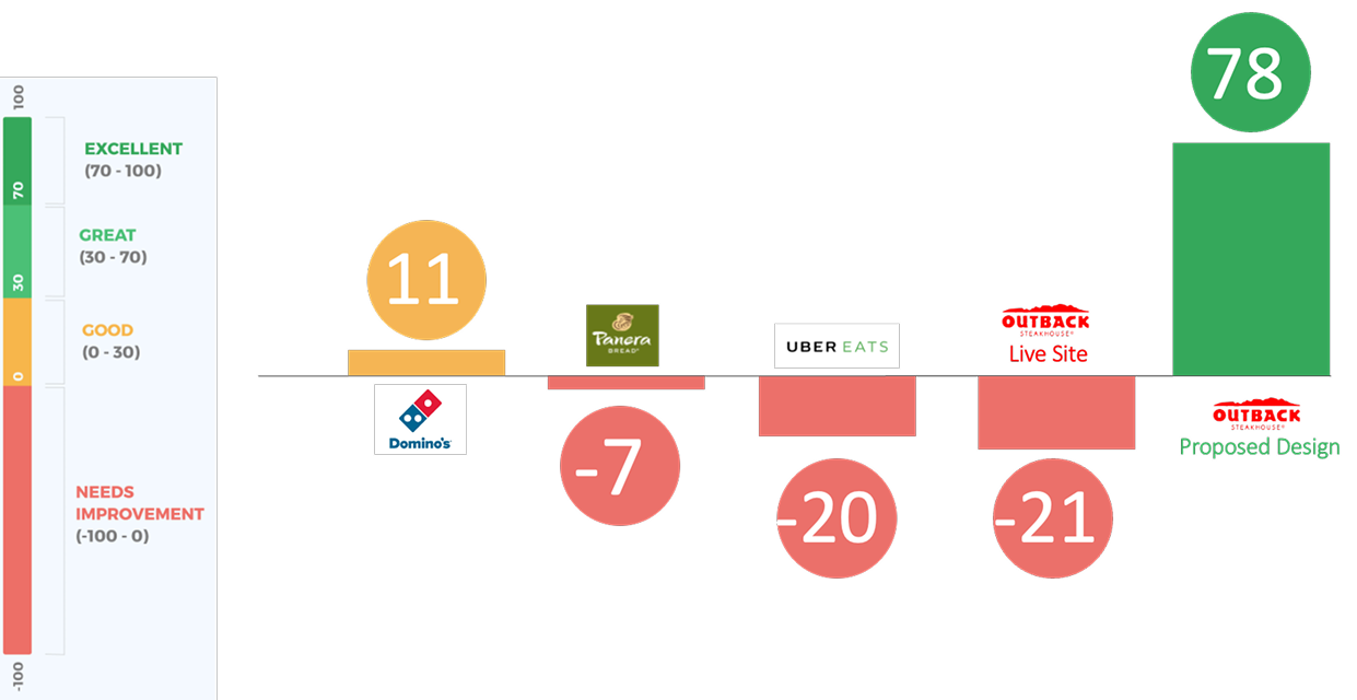
Final outcome
Improved UX earned the highest NPS score in the user testing compared to other competitors and current live site.
Key Learnings and Psychology Wins
-
Less is More (Hick's Law)
15% conversion lift by reducing menu categories -
Progress = Motivation (Zeigarnik Effect)
27% fewer abandoned carts with progress tracking -
Emotion Drives Action
Temperature graphic became most-loved feature (85% positive) -
Defaults Dominate
12% more curb-side orders with "Pickup Now" pre-selected
Scroll Down