Design system and Pattern library
A curated collection of design systems and pattern libraries created for various clients, showcasing scalable and cohesive design solutions.
Wearing the Design Systems Hat
Across these projects, I took on roles as a Design System Lead and Senior Design Consultant, working closely with cross-functional teams including front-end developers, brand strategists, and accessibility specialists.
- Tooling: Utilized Figma, Sketch, Axure, Proto.io, Storybook, and token management systems tailored to each client's ecosystem.
- Scope: Featured work for NSW Department of Spatial Services, Servicen NSW, Allianz New york, Wellcare, S&P, Elite Nine, Bloomin' Brands and many more.
My Design DNA: Framework & Approach
I follow an accessibility-first, token-driven methodology inspired by atomic design principles:
- Foundations: Colour, typography, spacing, elevation, motion, and design tokens.
- Components: Buttons, forms, nav elements, modals, cards—built with accessibility baked in.
- Patterns & Templates: Reusable flows (e.g., onboarding, authentication).
- Documentation: Usage guidelines, dos and don'ts, accessibility notes.
- Governance: Contribution model, versioning, and change management process.

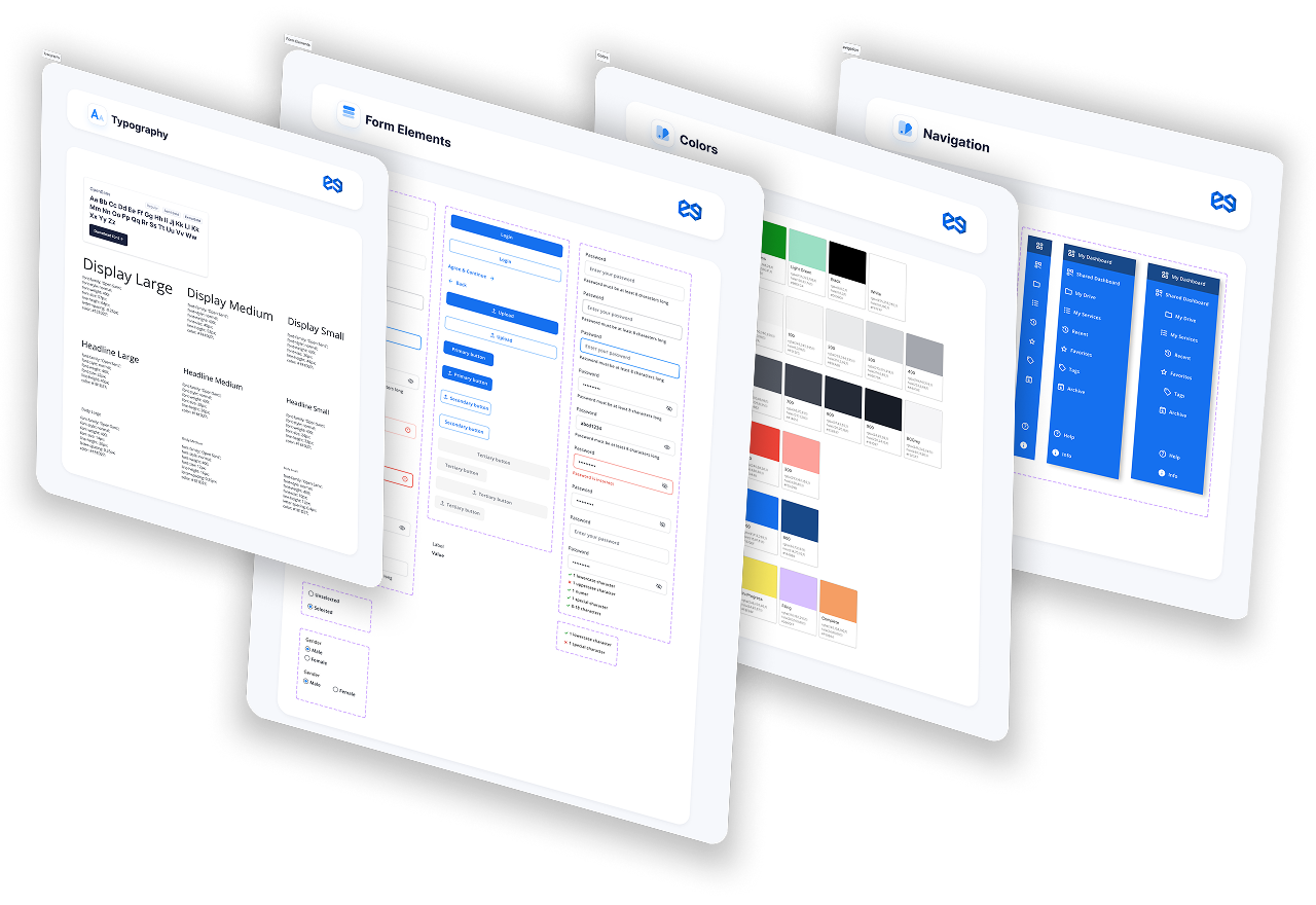
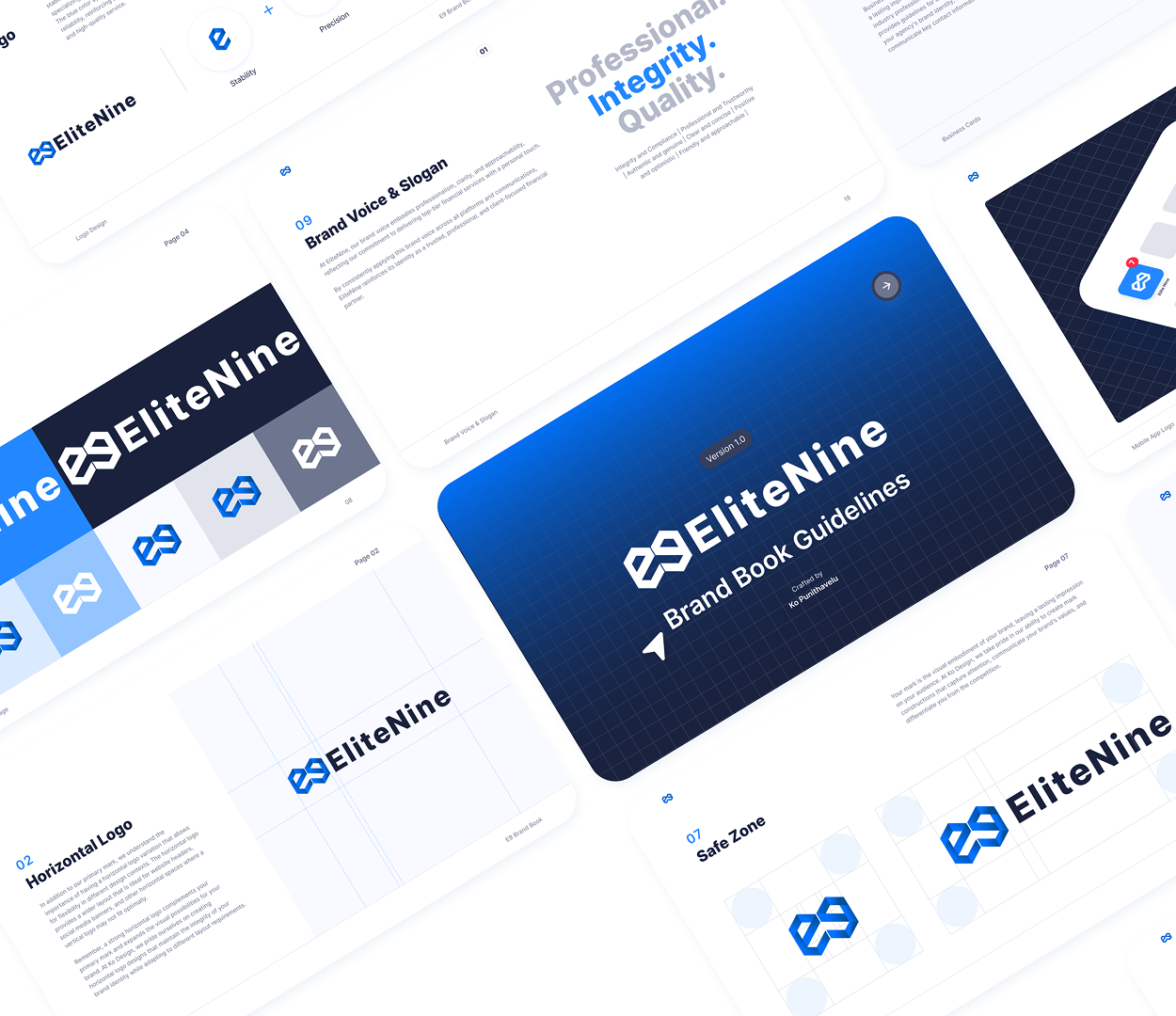
EliteNine
Challenge: Establishing a foundation for a new B2B and B2C SaaS product.
Solution: Developed a minimal viable design system featuring scalable React JS components and comprehensive guidelines. Additionally, designed a brand book for cohesive visual identity.
Impact: Enabled the product team to deliver MVP 2 months early with consistent UX.

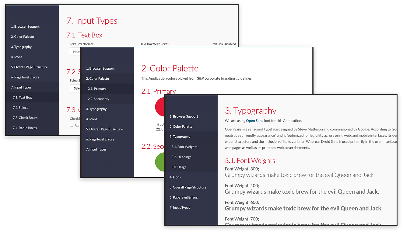
WellCare
Challenge: Fragmented UI and inconsistent UX across multiple Medicare portals.
Solution: Unified the digital experience through a scalable design system. Integrated accessibility testing, created reusable components, and aligned with brand and dev teams.
Impact: Reduced design duplication by 45%. Increased accessibility compliance score to WCAG 2.0 AA.
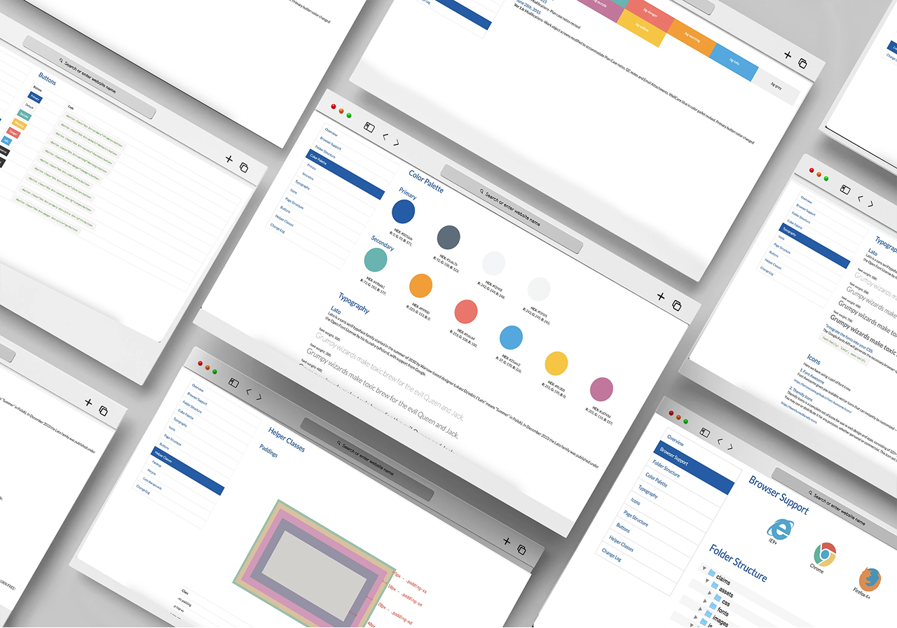

S&P Global
Challenge: Brand inconsistencies across financial intelligence tools.
Solution: Led token-based theming initiative, harmonising UI across multiple applications. Facilitated developer handoff with embedded documentation.
Impact: Reduced onboarding time for new designers by 30%. Increased design-to-dev velocity by 40%.
The Art and Impact of Systems Thinking
My approach to design systems is grounded in usability, scalability, and inclusivity. Whether refining an existing system or building from the ground up, I bring a structured yet adaptable methodology to ensure design systems empower teams and elevate user experiences across sectors.
Outcomes & Learnings: What Worked, What Wowed
- Design systems improved speed, consistency, and accessibility across products.
- Collaborative documentation and governance models led to higher adoption.
- Accessibility-first approach gained stakeholder trust and met compliance goals.
- Key takeaway: Design systems must be flexible frameworks, not rigid rulebooks.
Scroll Down