Blog
Apple's Liquid Glass Design: Beautiful, But Is It Accessible?
Apple's Liquid Glass Design: Beautiful, But Is It Accessible?
Apple has long been a leader in setting design trends. From skeuomorphism to flat design, and now to what many refer to as glassmorphism or liquid glass, this visual style is elegant and sophisticated. But from an accessibility perspective, it raises important questions.
The Appeal of Liquid Glass
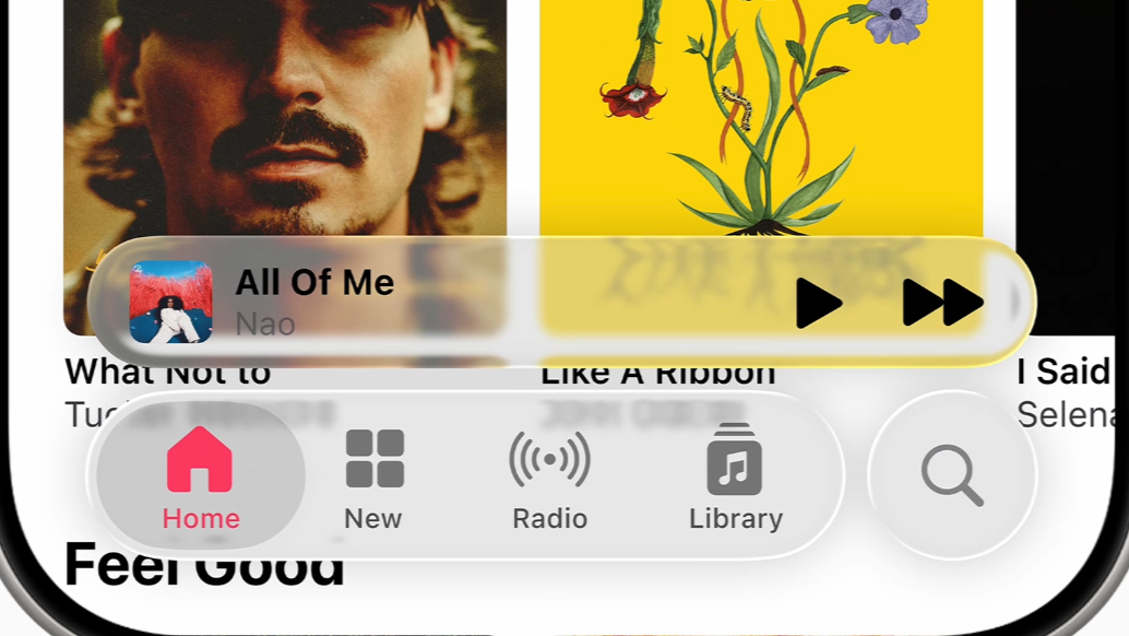
Liquid glass creates hierarchy with soft blur, translucency, and layered depth. It can feel modern and fluid. The challenge is that the more minimal and visual a design becomes, the more it can exclude users who do not interact with interfaces in conventional ways.
Accessibility Gaps Beneath the Surface
- Low contrast risks: translucent panels often reduce text legibility over dynamic backgrounds.
- Motion sensitivity: subtle parallax and animation can cause discomfort for vestibular-sensitive users.
- Assistive technology support: custom visual patterns without strong semantics can create confusing screen reader feedback.
Lessons from This Pattern
- Can users navigate confidently without relying on visual polish?
- Are we optimizing for elegance over usability and inclusion?
- Does the interface work by default, or only after users adapt settings?
Moving Toward More Inclusive Visual Design
- Follow platform accessibility guidance from the outset.
- Test color contrast with dynamic content, not static mocks only.
- Use clear visual anchors and structural affordances.
- Provide fallbacks for reduced motion and visual effects.
- Validate designs with people who rely on screen readers and other assistive technologies.
Great design balances aesthetics with usability. Liquid glass can be beautiful, but if it does not work for everyone, it remains incomplete.
Prefer seeing the work in action?
Explore my UX case studies, interactive prototypes, and end-to-end product thinking.
View the Portfolio Home